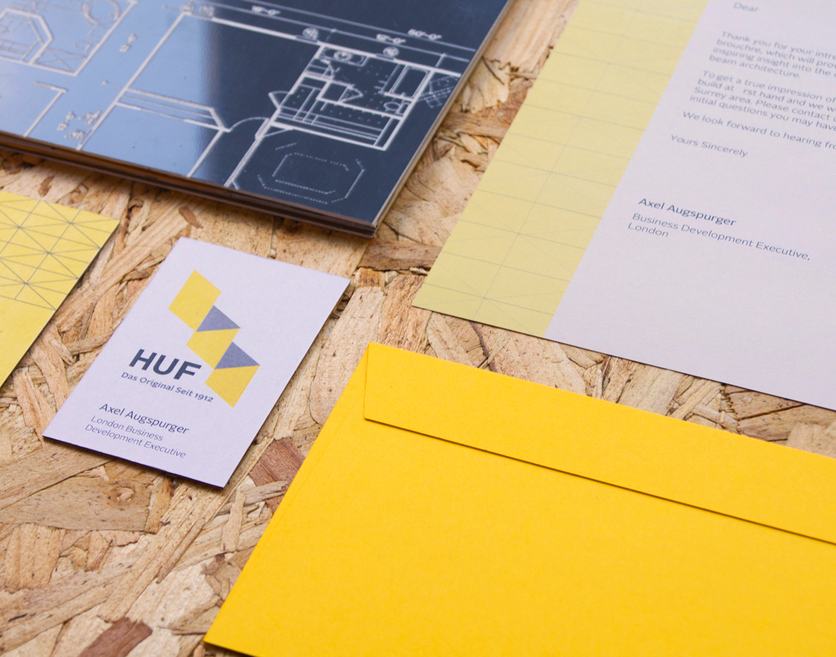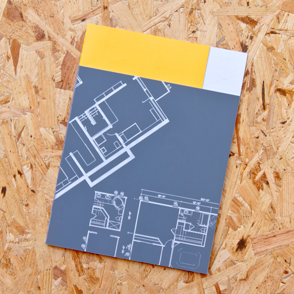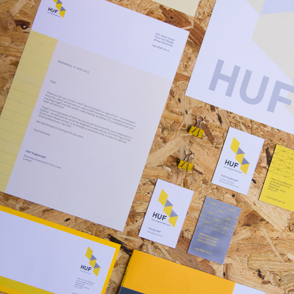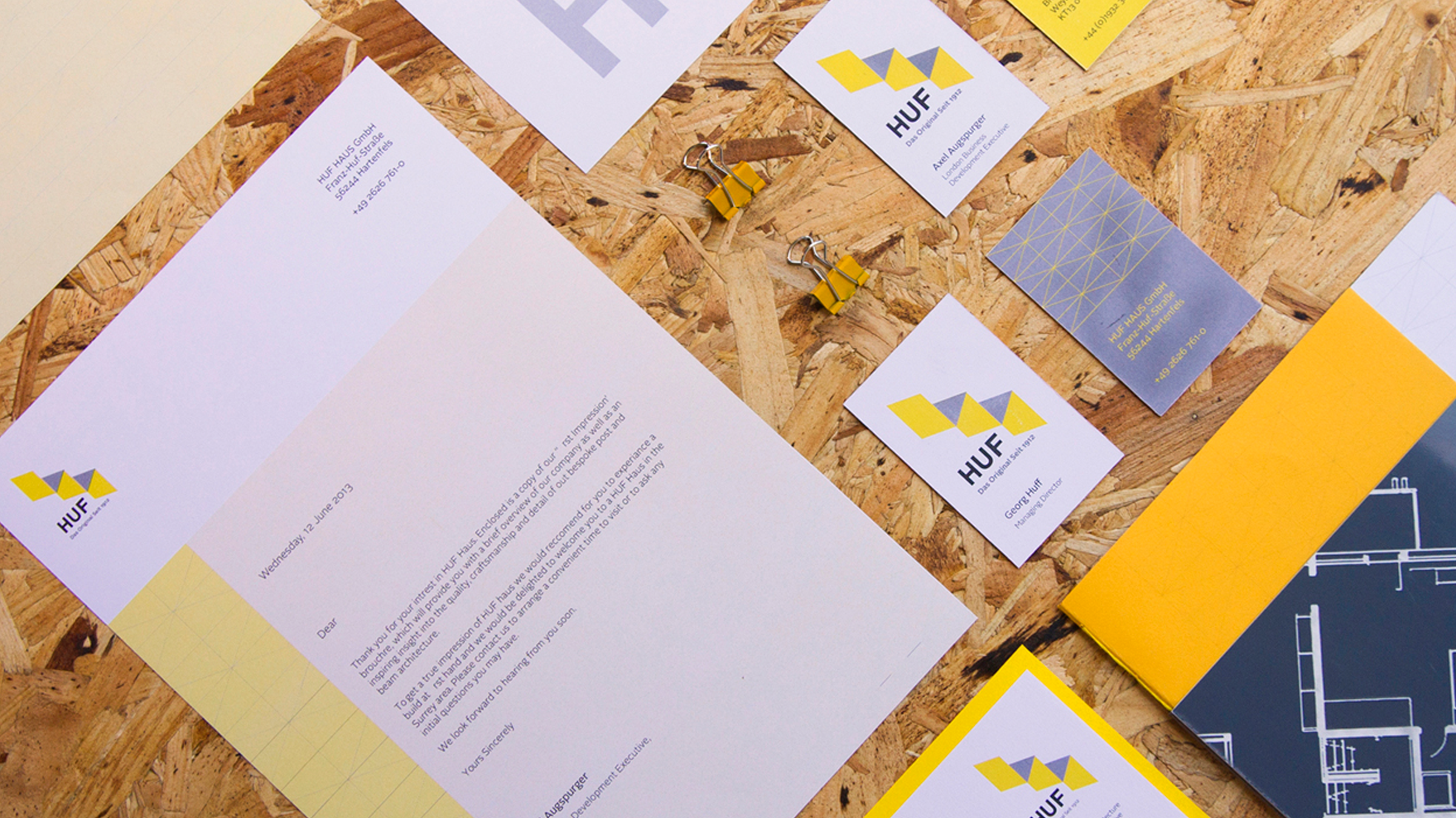

Structure & Grid
Inspired by the unique shaping of the Huf Haus we used the shallow pitching angle of the Huf roof as a basis for a grid to set everything against. This grid is made visible in some of the branded pieces to illustrate their proud engineering history.
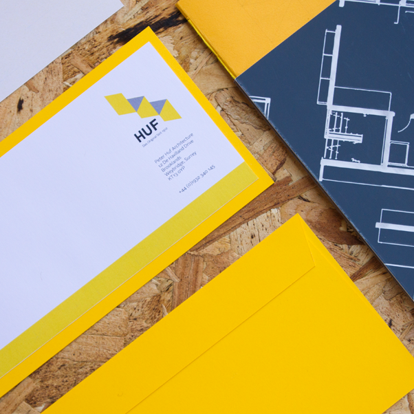
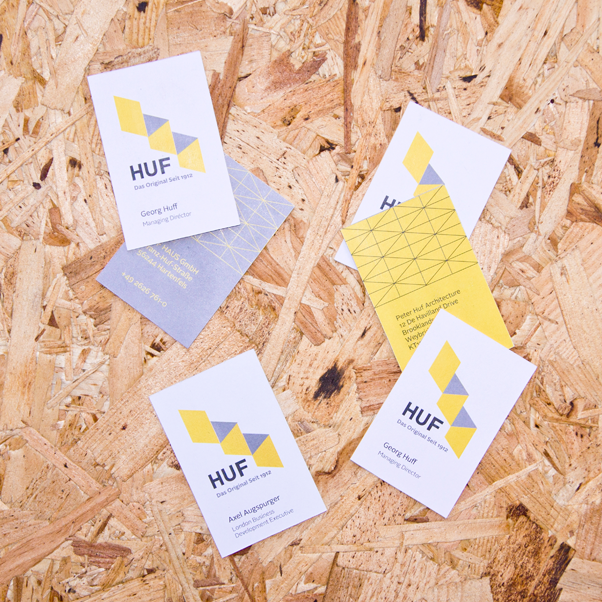
Modernisation
The main purpose of this rebranding concept was to modernise the brand to compliment their modern appeal and the invention of the Huf Haus itself. This is implemented with an eye-catching yellow that symbolises innovation and a modular double H logo in homage to Huf’’s modular pre-fab system.